Posted: September 17th, 2003, by Marceline Smith
We went to The Lighthouse on Sunday, Glasgow’s design and architecture museum. I love The Lighthouse, the way it’s hidden away in the back streets of the city centre, the way the staff always want to know where you’re going, the millions of escalators, the shop filled with expensive wonders and designer geek stuff and the restaurant right at the top where you get lovely crumbly shortbread free with your coffee.
Anyway, we took our dad (yes, I realise my dad visits a lot – there’s one reason for this and you spell it I-K-E-A) since he’s an architect and we wanted to see the Contemporary Japanese Posters. The posters were pretty cool but, really, once you’ve seen the one for Ueno Zoo, the rest don’t look so great:
We didn’t brave the hundreds of stairs to the top of the Mackintosh tower this visit (exhausting but worth it for the best view of Glasgow outside our bathroom) but we saw some newspaper photographs of the year and sat in the mobile cinema (which was pretty dull, sadly) and then spotted a fantastic little exhibition of self-assessment forms called Everything in Moderation. The idea is you take one home and keep track for a week of your eating, drinking, excercising and leisure habits and then tally it all up at the end to see what you learn and then take it back in to display with the others. I’ve got mine stuck up at home to fill in each evening but I doubt I’ll remember to bring it back in. Which is a shame as I enjoyed looking at the ones there. I’m also ashamed at quite how amusing I found the one that someone had filled in as Darth Vader but it was done with such detailed care and seriousness that I couldn’t help it.
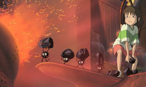
Also good (good meaning fantastically tremendous) was Spirited Away which I have been looking forward to for EVER but I’m glad I waited to see it in the cinema with an audience who were totally into it. Sadly the dubbed Disney version but actually really well done unlike the crappy Princess Mononoke one. Anyway, it’s a total Alice in Wonderland tale of Chihiro who wanders into an abandoned amusement park (what were you thinking?!) and inevitably ends up trapped in the spirit world with her parents turned into pigs and has to get a job in a bath house to free them and get back home. Not the most exciting of plotlines but it’s all really a context to bring in the wonderful characters. The spirits range from creepy to ugly to cute to hilarious with my favourites being the sad-masked No Face and the return of the soot sprites from Totoro as coal carrying slave spiders but really there’s not a single character that didn’t have me enthralled, one way or the other. I can’t wait to see it again. GO SEE.
Filed under: art and design, film and video | Comments Off on Weekend of art
Posted: August 5th, 2003, by Marceline Smith
New Pitchfork design brilliantly illustrates why advertising on websites is bad and wrong. I couldn’t keep my eyes in one place long enough to actually read anything on the front page. Also, why the huge screen resolution? After a series of jobs where I would covertly read websites during work hours, I now have the fear of full size web browser windows and particularly resent scrolling to see YET MORE ADVERTS. I really like Pitchfork and I wish they’d stop shooting themselves in the foot like this. I like the brown though, it’s a very underused website colour.
This bad web design/usability thing seems to be a growing problem generally though. I’ve been wandering around the web quite a lot lately and I’m surprised at how few music/culture/etc. websites are well designed. They all seem cluttered, over-designed and difficult to navigate. Maybe I’m just becoming mental over web design now that I spend my days designing horrific websites for magicians and garden pond makers but is it too much to ask for simple, understandable navigation, readable text, a minimum of scrolling and NO FANCY GIMMICKS? God, I feel old. Again.
(Having read the above, try and imagine exactly what my response was to a colleague suggesting I used FRAMES on diskant…)
Filed under: art and design, interweb | Comments Off on Goodness me!
Posted: June 18th, 2002, by Marceline Smith
I’m just back from the fine city of Edinburgh where I was amusing myself in the style of someone with no money. Firstly I took myself to The Art of Star Wars exhibition with unemployed person discount yay and spent a good couple of hours wandering about engrossed in the pictures and costumes and spaceships. More on this later but go if you get the chance.
After that and some nice dinner we watched television, sorry watched Television [ha ha HA! see what I did there?]. We arrived about 9pm only to discover much cheering as Television took to the stage. So no James Orr Complex for us, boo. The venue was utterly packed and we could not see a single thing. If I stood on tiptoe I could make out the lights at the top of the stage but that was it. Luckily we were tipped off to the back stairs and side stage views so got ourselves a prety great view. I spent most of the set just thinking ‘Loooook! It’s Tom Verlaine!’ which was almost exciting enough for me. When I got a copy of Marquee Moon back in 1990ish and named my pot plant after Tom Verlaine I never thought I’d get to see them live, even when they reformed a couple of years later. So, to be standing mere feet away and hear all the hits had me unable to remove the stupid grin from my face. I’m glad I didn’t listen to the records or anything before I went to the show as it was way better being reminded of everything as it happened, the guitar lines seemingly indelibly imprinted on my memory. Highlights were pretty much everything they played off Marquee Moon and a fantastic Little Johnny Jewel. I’m listening to a live tape of them from 1978 as I write this and apart from the sound quality you’d hardly notice those 24 years in between. The Strokes wish they were half as cool as 2002 Television in their dad clothes, let alone 1970s hipster Television.
Filed under: art and design, live reviews | Comments Off on Television, Liquid Rooms, Edinburgh
Posted: May 29th, 2002, by Marceline Smith
I went to see mùm the other night and they were mmmmm lovely. All soft and pretty with sinister quirks and clouded with atmosphere. We all just stood silently and blissful. Sigh. They had the epicness of Godspeed, the swirlingness of Slowdive, the modernity of electronica, the simplicity of Mogwai, the wide-eyed wonder of child angels. They were beautiful.
For some reason this reminded me of Bill Drummond‘s latest episode [Bill Drummond’s life always seems to me to be a series of episodes] – selling 20,000 pieces of his Richard Long photograph. Alistair Fitchett describes it all so well [as always] on Tangents.
Filed under: art and design, live reviews | Comments Off on mùm
Posted: March 30th, 2002, by Chris H
Things I did included looking at the Warhol exhibition. Some amusing things about it:
* The sculpture of replica Brillo boxes was a replica of the sculpture of Brillo boxes.
* The film of the Empire State building (supposed to last all night) is the edited highlights.
* You aren’t allowed to take pictures of paintings made from photographs ripped out of magazines.
Still not sure what I think of Warhol. The pictures I like and you’ve got to respect how ubiquitous they’ve become (I can’t see Marilyn Monroe without thinking of the yellow hair and pink lips silk-screened on). The other stuff, the celebrity worship and glossy surfaces, I’m suspicious of. It feels like he is used to justify all sorts of annoying tedious crap, a fig leaf for artists that revel in their own pointlessness and vapidity. Once he did that he left no further for artists to go down that route and if the route wasn’t so commerce-friendly it would be seen as just a pretty little cul-de-sac.
Filed under: art and design | Comments Off on Just got back from London
Posted: March 29th, 2002, by Simon Minter
I went to check out the Body Worlds exhibition thing in London today, and I gotta say that it was BORING. For some reason I was expecting some kind of artistic event, which would leave me shocked and intrigued, but instead I was faced with a Natural History Museum-style exhibit of bodies and body bits in glass cases and unimaginative ‘poses’. I’m as interested as the next person in seeing bodies preserved through the magic of ‘plastination’, with nerves, muscles and bones exposed to varying degrees, but I found this to be a confusing and hastily-prepared show. Maybe it’s because the bodies, despite being real, just didn’t look real, so there was no sense of ‘oh, so that’s how I look inside’, or maybe it’s because it was so busy and full of people who seemed to think that having read one article about how one organ works gave them the right to loudly lecture the other visitors on the ‘precise’ workings of the body, but it was a disappointment. It’s not like you get to see a skinned horse carrying a bones’n’muscles person who’s holding two brains every day, but Body Worlds made me feel like I do. Gah.
Filed under: art and design | Comments Off on Body Worlds
Posted: February 22nd, 2002, by Simon Minter
in a big box sent all the way from america.
it’s about twelve inches by twelve inches in size, with a delightful repeated motif of the X from House Gothic 23 Extended Bold all over it in a fetching brown and white design. WHAT A RESULT!
cushions are the new rock and roll, for this week
Filed under: art and design | Comments Off on my cushion arrived
