
James Olsen
I’ve always found it kind of pretentious when people interview friends of theirs but make no mention in the interview of the fact that they know the person, so I’m going to be upfront and confess that I’ve known James Olsen, illustrator for much of the liner art of …And You Will Know Us By Trail of Dead’s “Source Codes and Tags” cd, for going on 15 years now. I doubt that either he or I could count the times we’ve engaged in alcohol-fueled rages, three-way sexual dalliances with the world’s finest super models, or collapsed, weeping, into each other’s arms, desperately seeking some sort of escape from nihilism of modern existence. Hell, we even recorded a cover version of Hank Williams “Cold, Cold Heart” together. (Which can be found in the Music section of my forbisthemighty.com web site.)
When the fortunes of our mutual friends in TOD turned skyward, so did Mr. Olsen’s, as he was commissioned to do the artwork for the band’s debut cd on the honorable Interscope Records label, accenting the fact that Trail of Dead are about more than just the audio arts, but the visual disciplines as well. The following interview takes a look at James’ work on the album, the comic artists that affected his (and our) youth and his own musical output.
Wil: I’d like to begin with a play-by-play of your art in the “Source Tags and Codes” cd book. Starting out, who’s the laughing guy on the cd and back cover? Is he happy about having an Interscope label affixed to his shirt lapel?
James: That’s Henry Miller. I think he called himself “the happiest man alive” or something like that. I can’t think of anyone who wouldn’t be happy having an Interscope logo affixed to their shirt.
Wil: What’s the story behind the farm scene that opens the book? It looks warped – almost surreal.
James: That’s a copy of a Gauguin painting called “La Barriere”. I simplified it a lot…made it a bit brighter. I did a Crayola version of it. Originally, I thought it would be a good piece to accompany the “Source, Tags…” song, but we wound up using it for the opening instead.
Wil: The multi-panel page with the lyrics for “It was there (That I Saw You)” is most troublesome. You’ve got a naked woman reaching out to a table containing a seated demonic stuffed animal. Several men are groping a woman’s breasts. A burning deity is descending into a montage of a masked head and headless body. Is this a desperate cry for help?
James: Pretty much. Actually, I made those paintings while in a trance. That’s why they’re so sloppy. I wasn’t even really looking at what I was doing. I’d make a big mess on the page and leave it. Then, later–after I calmed down a little–I’d come back and try to tidy it up a bit–you know–make some sense of it. It’s a technique my therapist recommended.
Wil: Then there’s the page for the song “Baudelaire.” Is this the man himself?
James: Yeah…. That one was tough. I made several failed attempts…even Conrad did a version of Baudelaire. Somehow…he was difficult to capture. His face was very…complex. At the end of a long night of drinking I found myself there, staring at the unfinished portrait of Baudelaire–just about ready to throw in the towel–when suddenly it all began to make sense. Somehow…in my drunken haze I was able to really see his face, you know?
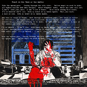
Wil: My favorite is the illustration for the lyrics of “Heart in the Hand of the Matter.” It reminds me a bit of the work of Dave Mazzucchelli who did the “Bat-Man Year One” comic.
James: That’s great–’cause that’s totally what I was going for. I love Mazzucchelli’s stuff. I really liked the stint he did with Frank Miller on the Daredevil series. And of course–the “Year One” thing was great. His stuff has this great cinematic quality to it, don’t you think?
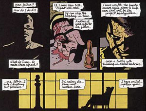
Wil: Absolutely, almost film noir. What was so interesting about the “Year One” comic was the fact that you couldn’t really place what era it was supposed to be in. The architecture and vehicles looked as if they were from the forties, but at the same time there was this appearance of bei ng very modern.
James: hmm….I really wish I had that here in front of me to look at. One thing that really struck me about the art in “Year One” was the coloring. I know Dave Mazzucchelli didn’t do the coloring* –but have you ever noticed how weird that shit looks?It’s so dark and muddy. They really should’ve printed that thing on a better quality stock of paper. I’ve never seen coloring quite like that in any other comic book. The old style of comic book coloring was really something else, wasn’t it? –all those little dots and blobs of color…. I think Bill Sienkiewicz really gave the Marvel colorists a challenge. On close inspection of some of those old New Mutants comics you get the feeling that sometimes the colorist just really didn’t know what to do with Bill’s work.
* Credit goes to Richmond Lewis
Wil: The page for “Monsoon” is a continuation of the “It Was There (That I Saw You)” page. There appears to be a woman strapped in her bed about to be devoured by dog/rats. Are you slowing going insane?
James: Yes and Yes!! You should’ve seen the other thing I made for “Monsoon.” It’s a painting of a boat sailing on this massive, breaking wave. It’s incredibly cheesy. Conrad said it looked too much like “extreme sports”.
Wil: Finally, the art on the “Relative Ways” page. There’s an alien looking over at a blue dog who’s wearing multiple sticks of dynamite mounted on his back while eating a pie. Is this Courtney Love as the She-Hulk? And naked bodies writhing in orgiastic fury? Make it stop, James, make it stop!
James: That painting was an offshoot from my…what did I call them?…”Trance” paintings…. The blue “dog” is a symbol I’ve been developing over the years. Usually people call it a “bull”, but I would’ve also accepted “bunny”, “ass” or “unicorn”…. Yeah…She-Hulk. I kinda thought that looked like She-Hulk too. But that wasn’t until after I’d already finished the whole piece. By that point I was like “fine…She-Hulk…whatever….” People usually make negative comments about the alien. To me it makes perfect sense. But I can’t explain it.
Wil: You mentioned Bill Sienkiewicz and like a lot of comic fans, you were particularly affected by his brief run on the Marvel Comic’s series “The New Mutants.” What was the appeal? What was he doing that was different?
James: I guess every comic artist has their individual style or whatever. But–at least at the time –it seemed like most of the mainstream artists were all using styles that…didn’t really deviate much from this sort of generic comic-book-art thing. Bill’s art was very anti-comic art…in a way…but it was also very effective narrative stuff. It seemed like he was creating his own story-telling language. Plus, if you really analyze his work–you’d have to admit that he’s just…very good. His skills are remarkable. He is a master illustrator.
 Wil: The thing I remember about Sienkiewicz is that he started off as a kind of mundane Neal Adams clone. Remember the stuff he was doing in Moon Knight? But then he just took off. He probably evolved more in front of his audience that any other comic illustrator.
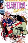
James: I’ve heard that Bill started out as a clone of some other guy. But I never got into Moon Knight, so I guess I’ll have to take your word for it. I always thought he was trying to be a Gustav Klimt clone. Compare their signatures and you’ll see what I’m talking about. But–you know–to copy a style successfully is really quite difficult. You really can’t just pull that stuff out of your butt. On Bill’s best work–the “Elektra Assassin” series–he was mixing styles left and right. His art was totally schizophrenic. But that was his strength, really. He could change styles at will. He was like the Bruce Lee of comic book art.
Wil: What about Frank Miller? Did you dig his shiz-nit?
James: Sure, sure…. Of course Miller is amazing….and he’s so prolific. Those two guys are in a league of their own…really each is in a league of HIS own.
Wil: You’ve got a co-songwriting credit on one of the “Source Codes and Tags” songs that only appears on the European release of the album.
James: Yeah. That’s “Invocation”…the album’s intro. It’s a short instrumental piece that I lent a few notes to. It’s too bad that got left off the American release of the album.
Wil: I know you also do a lot of music, a lot of layered Phil Spector style recordings. How does James Olsen the artist relate to James Olsen the musician?
James: …well…its funny you should ask, Wil. –‘Cause right now James Olsen the artist is really letting down James Olsen the musician down in a big, big way. I just finished recording this album that I spent over ten months working on. The music is done, but I have no artwork for it. I’m totally stumped.
Wil: I, of course, heard and enjoyed the recordings you did a few years What’s the new James Olsen sound? I’ve heard through the grapevine that it’s less moody and introspective and more tied in with the abundant joy of modern living.
James: …Well, I certainly hope that’s the case. I don’t really know what you’d call it…its sort of psychedelic, I guess. It’s a little under 43 minutes long. There’s a brief intermission at about the mid point. Then it goes on for another 21 minutes. There’s a dense fog of echo hovering over my album–and a heavy handed helping of the sounds of nature.
Wil: Do chicks dig artists?
James: Sure. Why not? We’re a good-time crowd